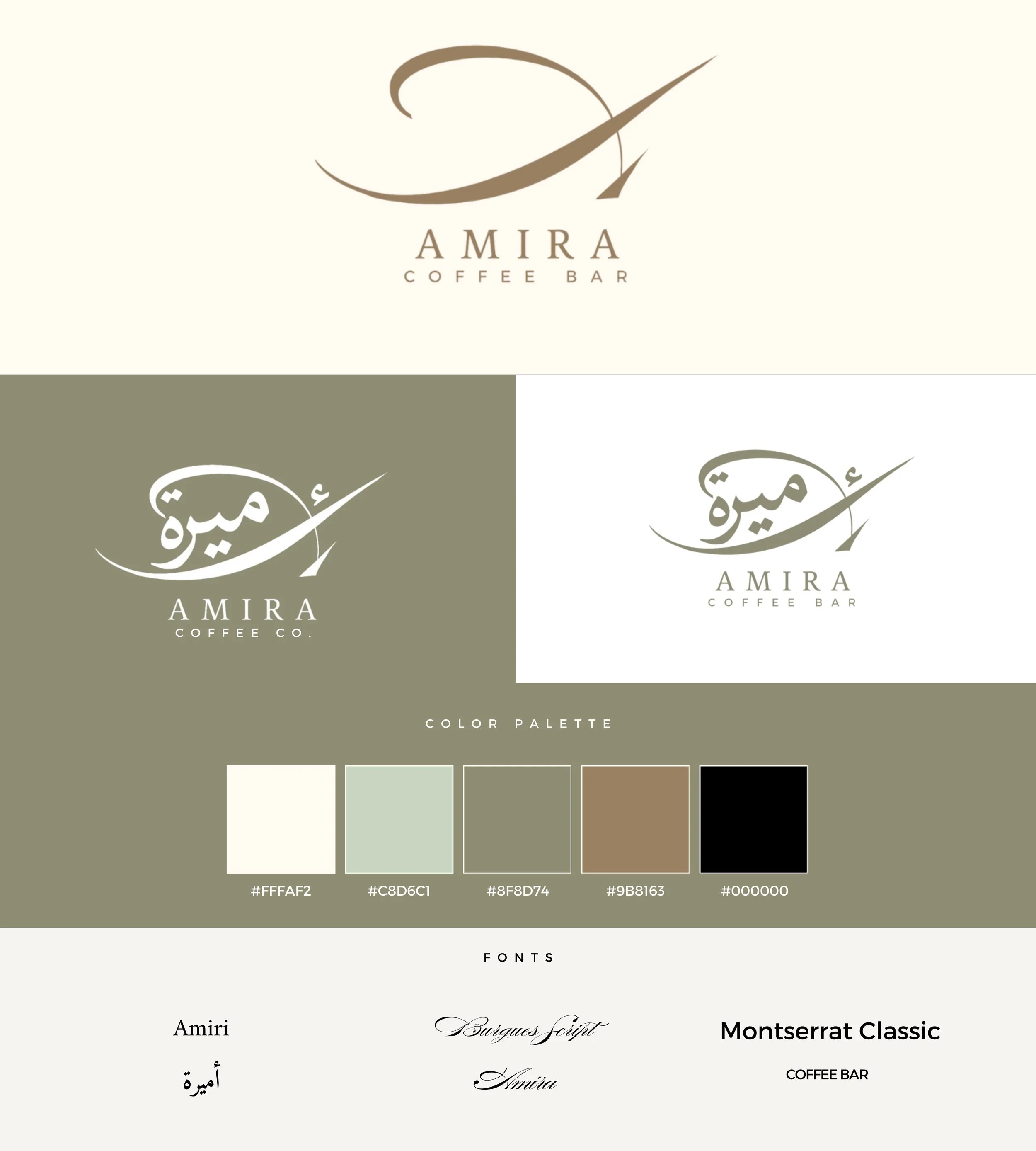
The visual identity came together through intentional choices that reflect Amira's essence. Our color palette tells a story of sophistication and warmth: a soft cream (#FFFAF2), a gentle sage green (#C8D6C1), our signature olive tone (#8F8D74), a warm taupe (#9B8163), and a grounding black (#000000). Each color was chosen to create an atmosphere that feels both elevated and welcoming – much like the experience we wanted to create in our space.
The typography choices were equally intentional. We selected three distinct fonts that work in harmony: Amiri for its cultural authenticity, Burgues Script for those elegant touch points, and Montserrat Classic for its clean, contemporary feel. The combination strikes a perfect balance between heritage and modernity, luxury and accessibility.
These elements came together in our brand style guide, ensuring every touchpoint of Amira Coffee tells the same cohesive story – from our event signage to our website.